September
One month has already gone by. The first projects are up on the bulletin boards ready for Open House on October 4th. My fellow teachers have been stopping in and telling me how great they are. Phyl stopped in yesterday to see me. It was great to see her and hear what she thought about my projects. It means a lot to me to continue the great program Phyl developed here.I'm having fun doing what I prepared to do in college over 30 years ago. I realize there's a lot to get through this first year and I will continue to adjust my methods and procedures but, overall I'm feeling excited. I'm so grateful there is a blogging community out there to support me. You all have a part in my metamorphosis from computer teacher to art teacher. As I post my projects this year, I'm going to try to give credit to all of you who have helped, but when I first started researching and saving lessons, I did not copy the website addresses. So if you are the one to credit, please let me know.
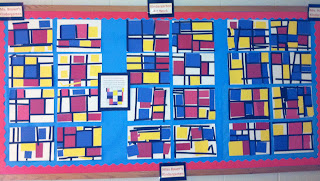
MONDRIAN ABSTRACTS- Kindergarten
 |
| Kindergarten used primary colored squares and rectangles in the style of Piet Mondrian to create their abstract pictures |
We began talking about horizontal (hamburger) and vertical (hot dog) ways to hold our paper. They put their white paper on their table in the horizontal position. We took a piece of black paper and I showed them how to use a glue stick, turn it over and stick it to the paper. We then took a colored shape and placed it next to the black line and glued it in place. I showed them how to line up another black strip around the shape, cut it and glue it. They were instructed to continue to cover the edges of the colored shapes each time they added another one.
Well some of them got it and others went off on "creative tangents". All in all I liked the results. The photos aren't the best. I'm not used to the new camera settings.
SUNFLOWERS- 2nd grade
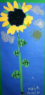
 My second and third graders worked on sunflowers. We had many blooming around the school this fall. I picked them just before the rain storms finished them off. We talked about the parts of a flower and looked at Vincent Van Gogh's sunflower pictures.
The second graders did cut paper flowers practicing on their cutting and pasting skills and used oil pastels for line details. I gave one class blue paper and another class orange.
Steps:
Day 1- Discuss parts of a flower. Draw stem, leaves and seed head. Cut strips of green paper and glue leaves, stem and sepals.
Day 2- Cut strips of yellow for flower petals and glue down so the ends stick out. Use oil pastels to do line details on flower, leaves, seed head and negative space.
SUNFLOWERS- 3rd grade
 |
The 3rd graders used tempera and oil pastels and worked on line detail & proportions. I changed the lesson, but saw an idea similar on Deep Space Sparkle.
Steps:
Day 1- Discuss parts of a flower. Draw vase, table line and seed heads. Divide vase in half.
Day 2- Use paint to fill in background, table and vase. All paper should be covered.
Day 3- Add line detail to vase, stem, leaves, table cloth, seed head and background(wallpaper). Lastly use yellow tempera to paint in petals.


Hi Cathy, your room and all the artwork really looks great!
ReplyDeleteA couple of blogging hints to get more people to read:
1) Give your post a title!
2) use a photo at the top of the post so a thumbnail will show up in people's dashboards.
Also remember hat I turned in the art room camera to Viv for the summer. It is a fabulous camera - I was so impressed with the quality that about a year ago I purchased one very similar, but still always loved the school one best. Shoot with highest resolution, and no need to reduce your photos. You will not run out of capacity for a LONG time coming, believe me! (I haven't run out yet).assessments?
Thanks for the ideas. You're right on target. Next time you stop in, I'll need a run through on blogging. THere's more I need to learn about posting and blog format....
DeleteI have no idea where that word assessments came from. I didn't type it. The iPad has the most bizarre autocorrections. Sorry!
ReplyDeleteI love the bright colors your kids used for the sunflowers. Looks like your hallways are all set for Open House and that you are off to a great start. Congrats!!
ReplyDeleteThanks so much. They really look great and the kids had fun doing them. BTW your blog has been a great help to me.
DeleteAll the projects look great! What a wonderful start to the year! :)
ReplyDeleteThanks. I appreciate your kind words.
DeleteHi Cathy, I noticed you taught Piet Mondrian to your students in September....as did I!!! Love how the projects turned out, I can't wait to place mine on display too! I enjoy reading your blog, chanced upon it from Phyl's blog :)
ReplyDeleteThanks for visiting. I'm a newbie to blogging even though I taught computers for 15 years! I feel funny about posting lessons I borrowed from other people's sites because they weren't my original idea, but I guess I have to start somewhere and then there's a better chance for others to link up.
DeleteI think your 6th graders did my lesson here http://www.blogger.com/blogger.g?blogID=4497814921450541701#editor/target=post;postID=3058838947040157919 but it is also equally possible someone else had something similar! Your doing a great job with your new assignment:)
ReplyDeletesuzanne
You are right. Googled you for the correct link and added it. Thanks for letting me know. It was a great beginning lesson for them and me!
ReplyDeleteI remember I did this project years ago with middle school, but only with watercolors. I got the students to mix the two colors used for the overlapped areas. This idea looks amazing too.....the pop of color is awesome! Something to consider next year! :)
DeleteT-Shirt, Design, and History | The T-Shirt by T-Shirt - The
ReplyDeleteT-Shirt for Women. op 사이트 T-Shirt. 100% cotton (T-Shirt graphite titanium babyliss pro design); Cotton where can i buy titanium trim (T-Shirt design); Cotton (T-Shirt design); Cotton (T-Shirt design); titanium build Cotton remmington titanium (T-Shirt design); Cotton (T-Shirt design